Carel
II 2023
web design
personal project
Role:
UX research
UX design
UI design
01 problem context
Carel is a high-end women's footwear brand that was founded in Paris in 1953. From the very beginning, they have focused on creating shoes for liberated women. By combining elegance with playful boldness and girlish charm, they continue to create designs that set trends, making them a beloved brand of fashion It Girls.
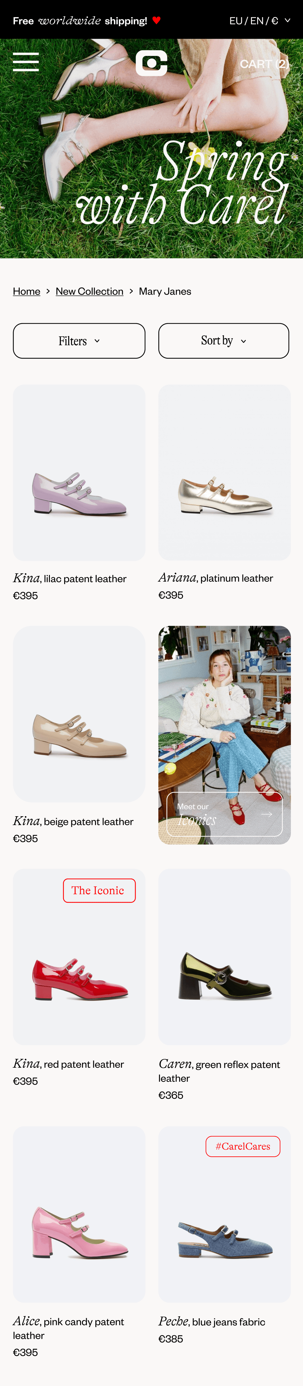
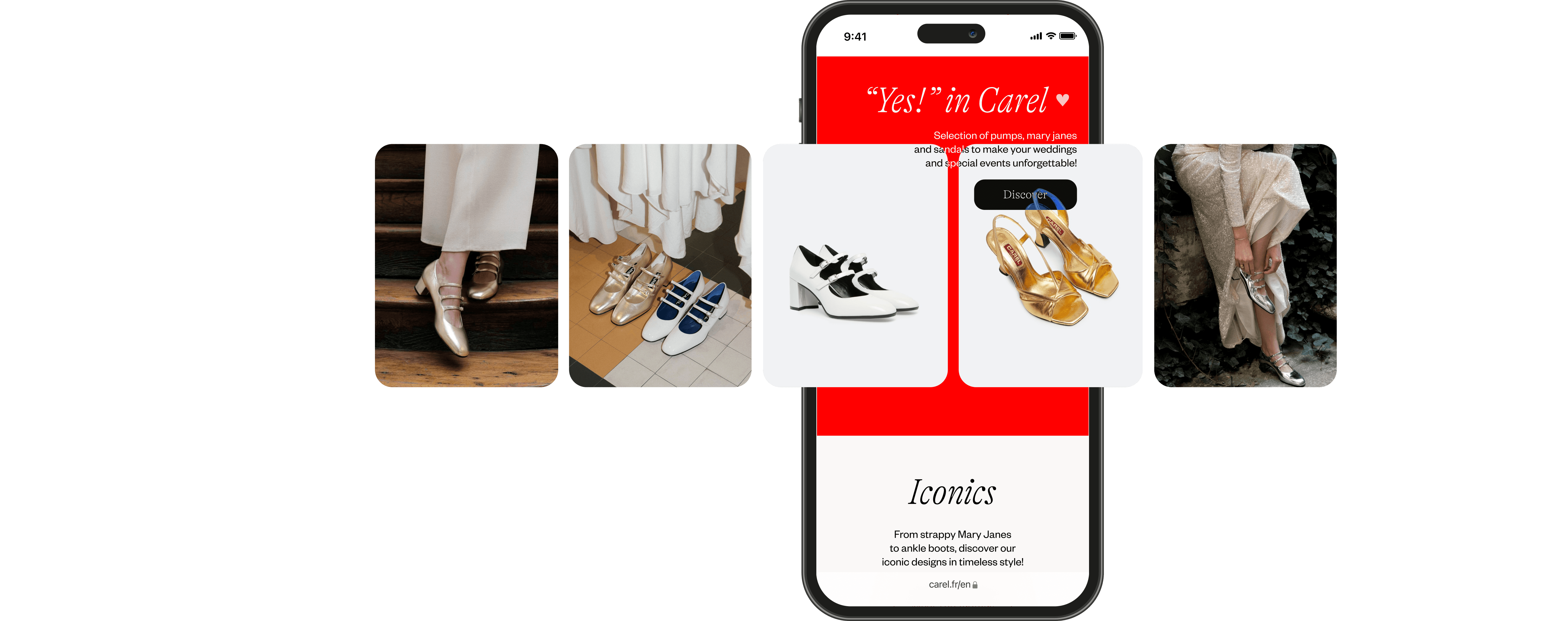
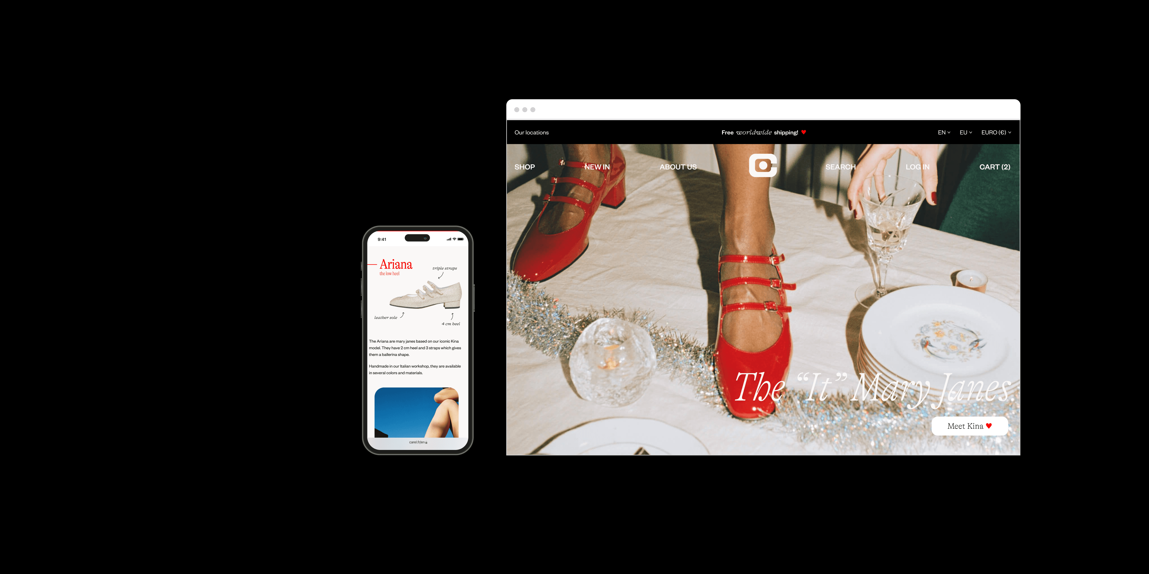
I redesigned the Carel website to better reflect the brand's innovation and character. The new design is focused on simplicity and elegance, with a touch of eclecticism. The redesign is confident and bold, just like the Carel brand itself.
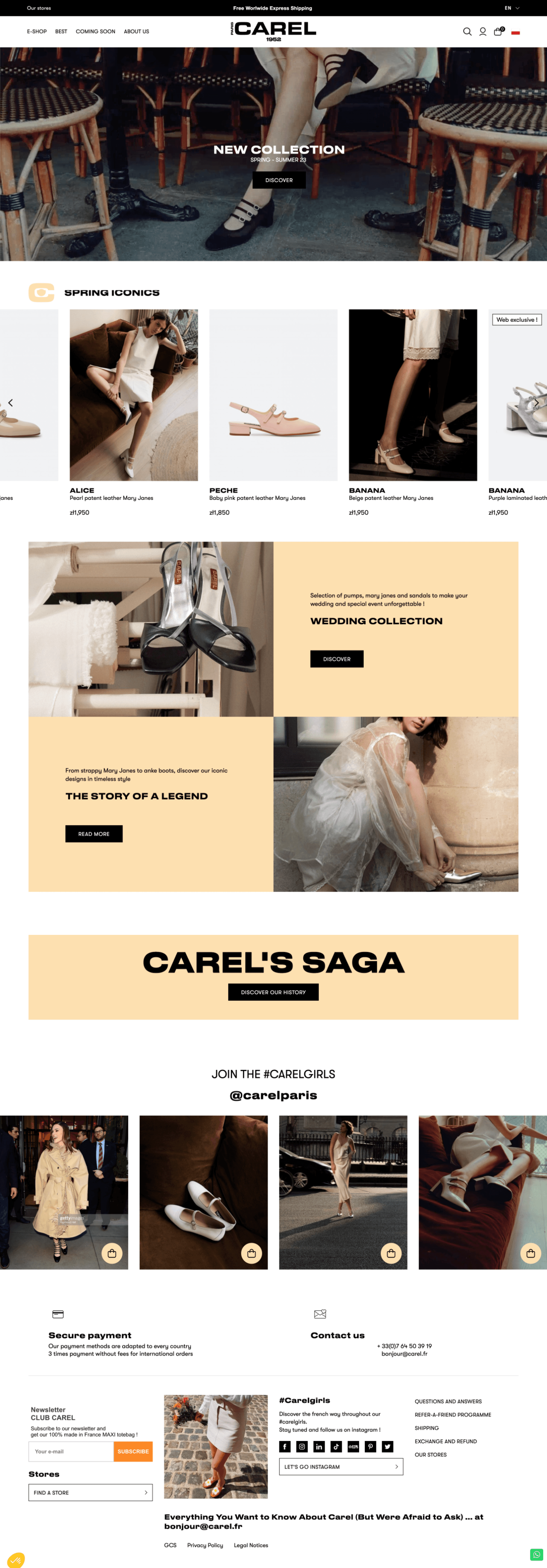
before / current website

after
02 process
03 research
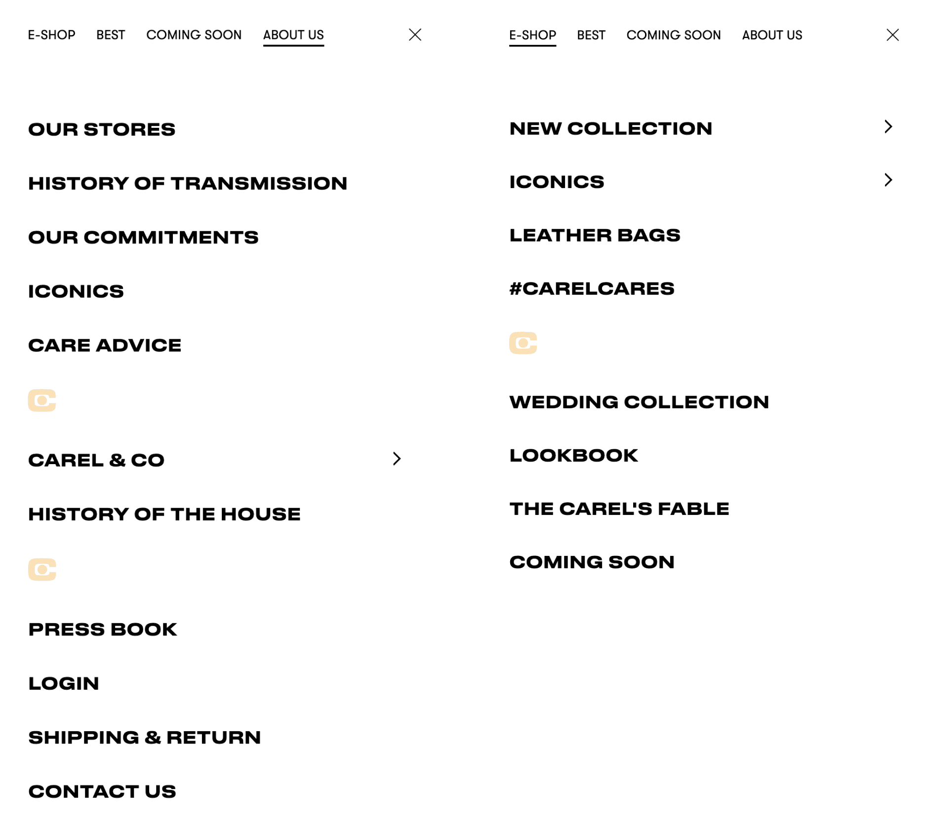
After a thorough analysis of the website, I conclude that the user journey is correct, but the division of categories in the menu and information architecture need improvement.
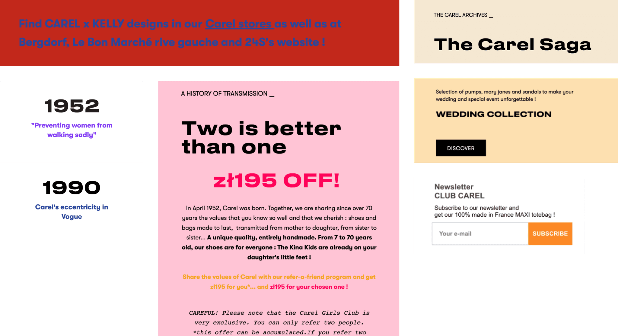
The biggest criticism of the website is its UI design - heavy typography, inconsistent color palette, excessive amount of photos, and a chaotic checkerboard-styled layout on every subpage. Additionally, there is a lack of interesting visual solutions that would be consistent with the character of the brand's products and improve the website's UX.
The weaknesses of competitors' websites (eg. Repetto, Freelance, Rivercour) are partly overlapping with the ones mentioned above. Therefore, improving the Carel website in those areas will help the brand to stand out from the competition, and could potentially increase sales through the brand's website. This will also help in transferring customers from sales platforms such as Farfetch, which will further increase the brand's reach and revenue.

04 UX design
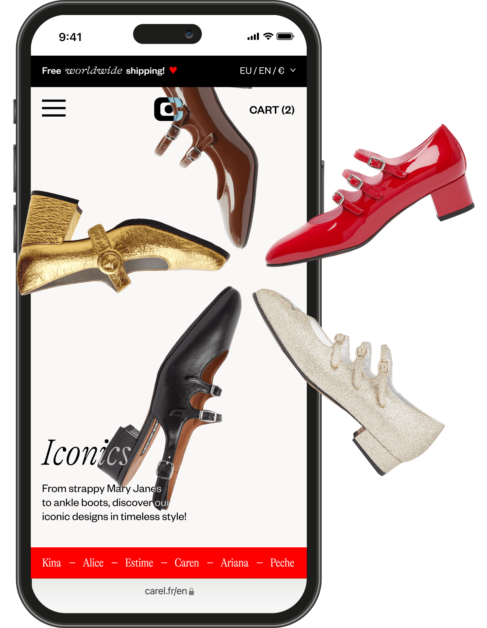
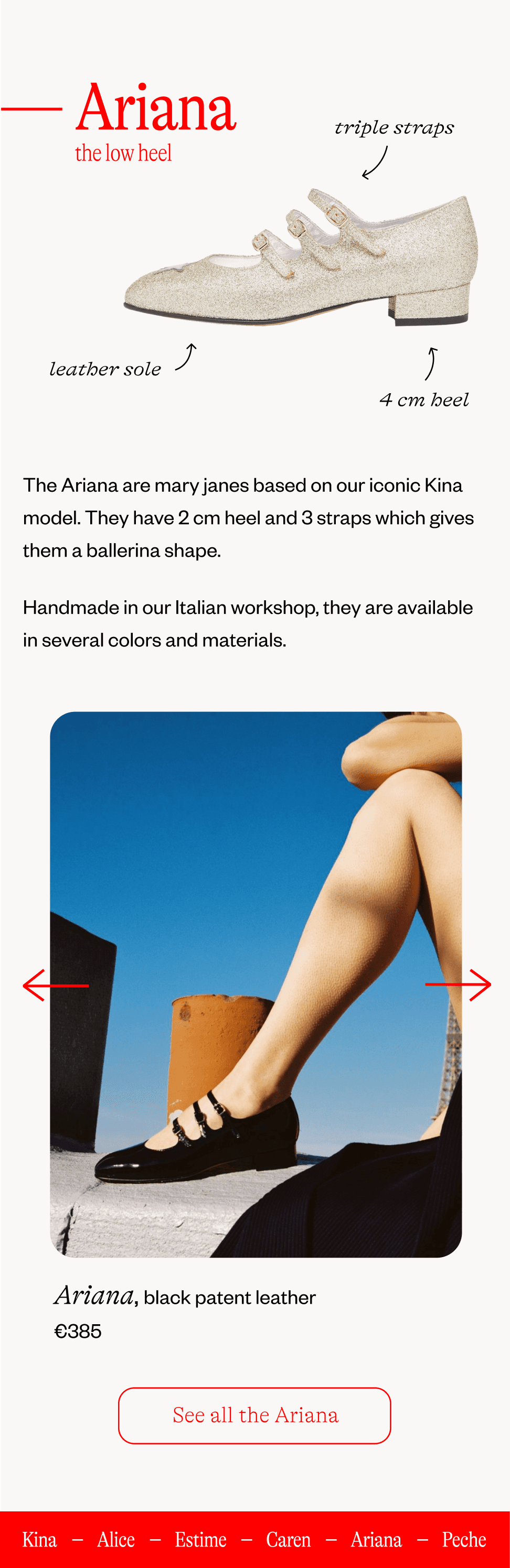
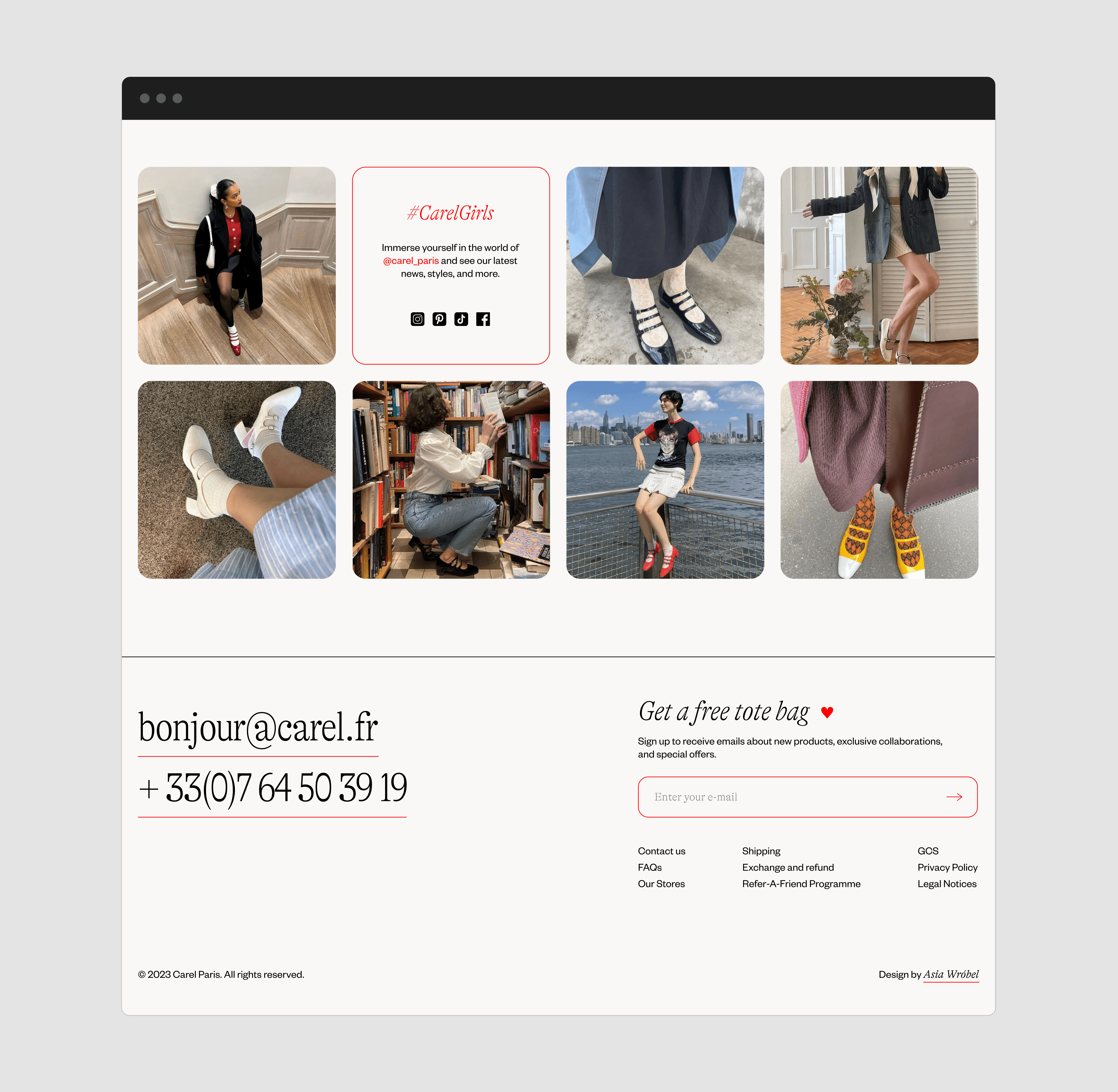
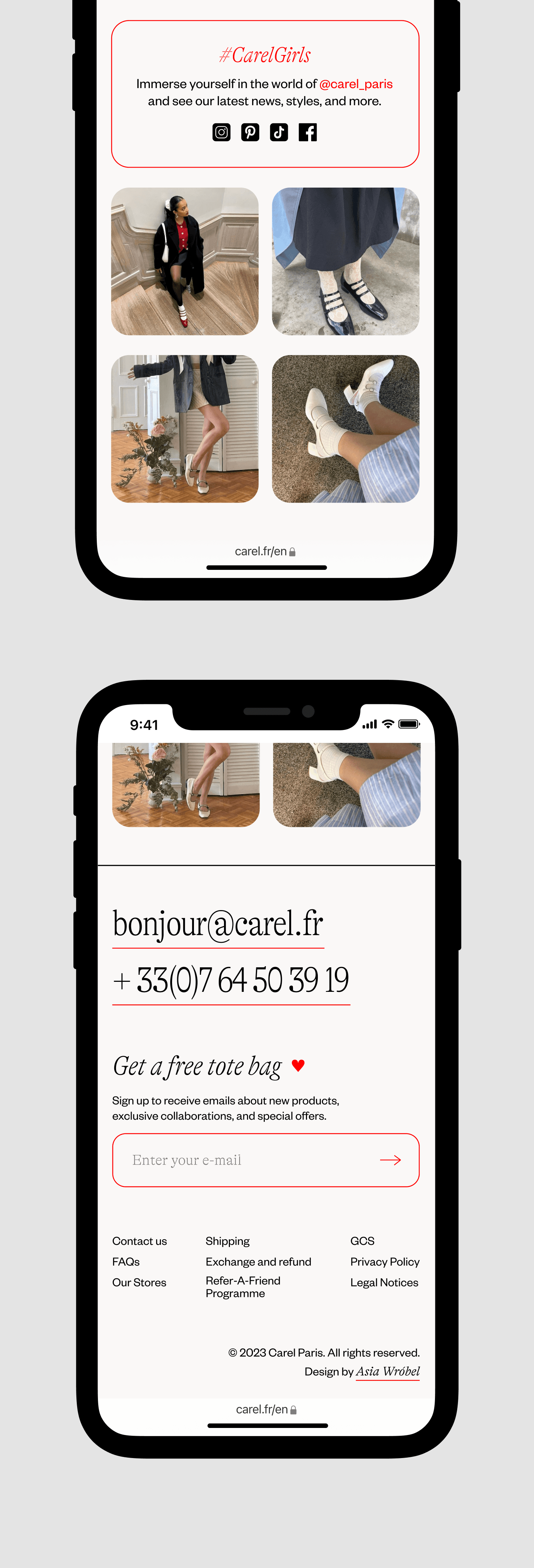
I made significant improvements to the menu structure, homepage, and footer. To make browsing more engaging, I added some experimental features to the "Iconics" and "History of the House" pages. These pages are now more than just fillers; users will find them enjoyable to read.
05 UI design
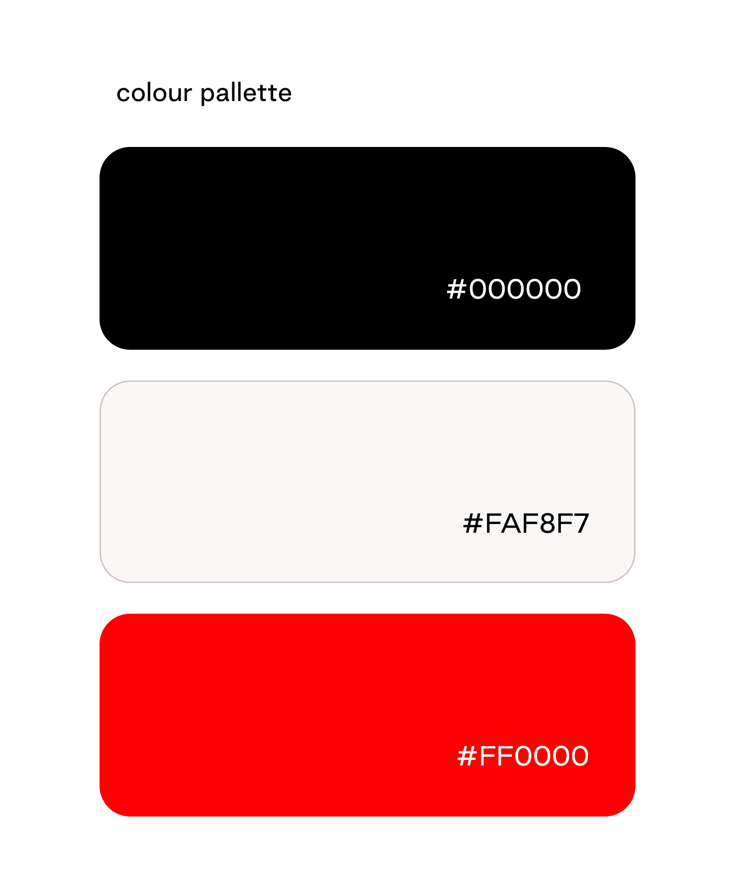
I went for a classic black and white color palette with a strong accent of sharp red, inspired by the red version of the Kina model - a cult footwear design that significantly elevated the brand's status in the last decade.
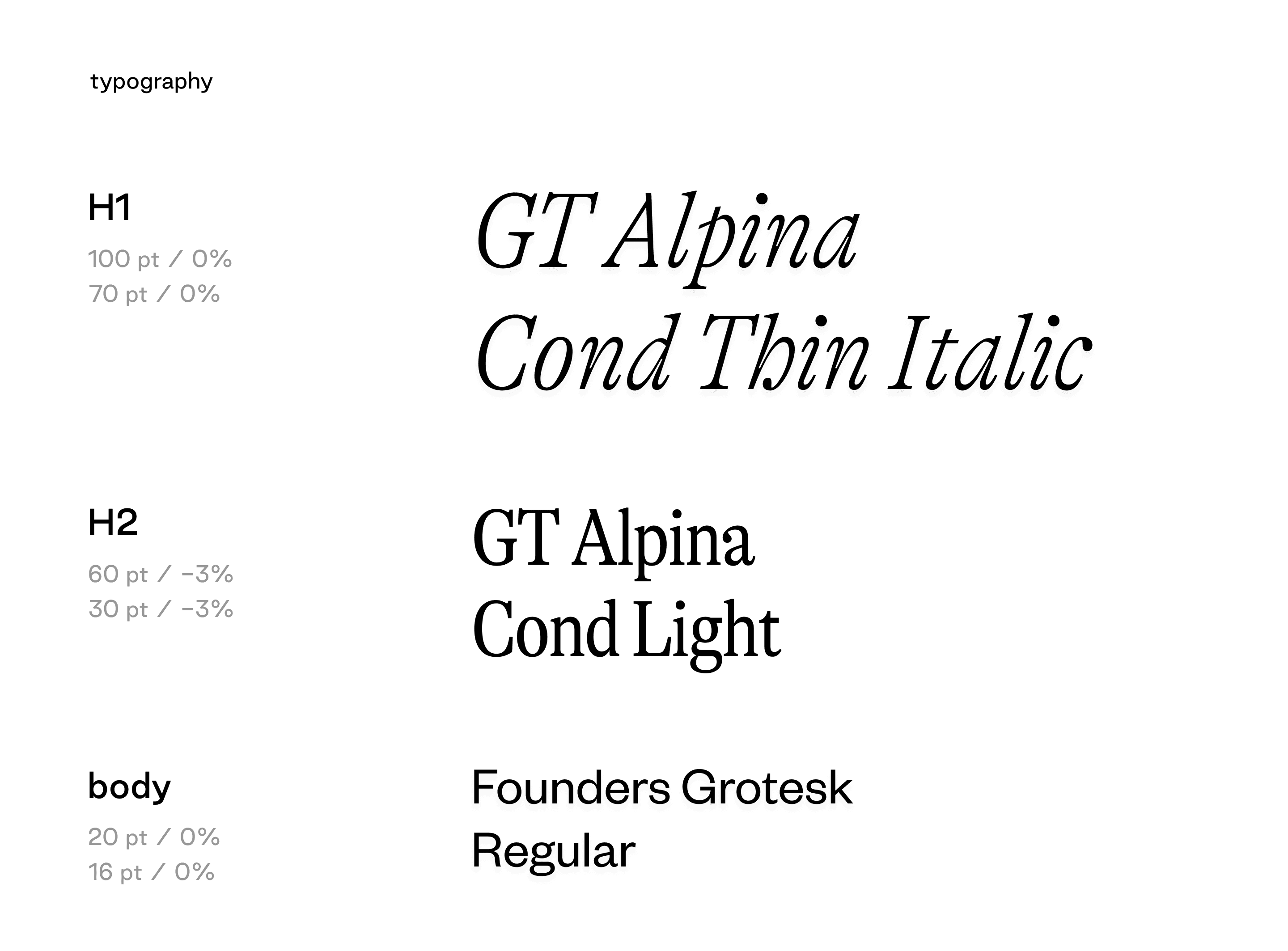
The elegant touch is given by the serif font GT Alpina in several variations, to emphasize the duality of the brand's character. For contrast, the body font is the sans-serif Founders Grotesk.