Mastercard OFF Camera
VI 2022-II 2023
web design
commercial project
within an agency
Role:
UX research (UX audit, competition comparison)
UX design
UI design
01 problem context
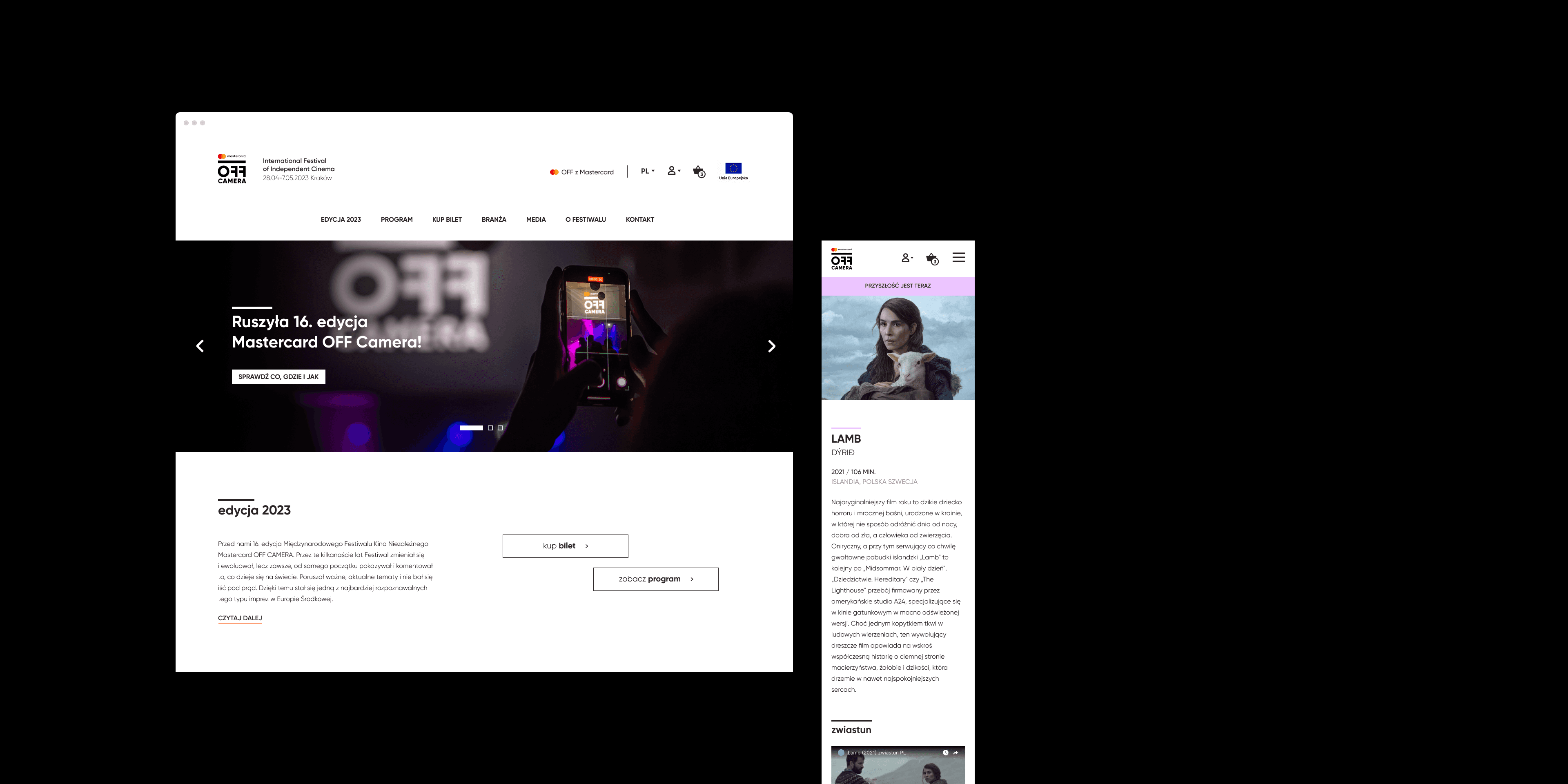
Mastercard OFF CAMERA International Festival of Independent Cinema is now an event that has its own brand, but its website did not reflect that. The information architecture of the website was confusing not only for the users, but also for the festival crew. The biggest problem, however, was its backend management, which led the client to move the website to WordPress.
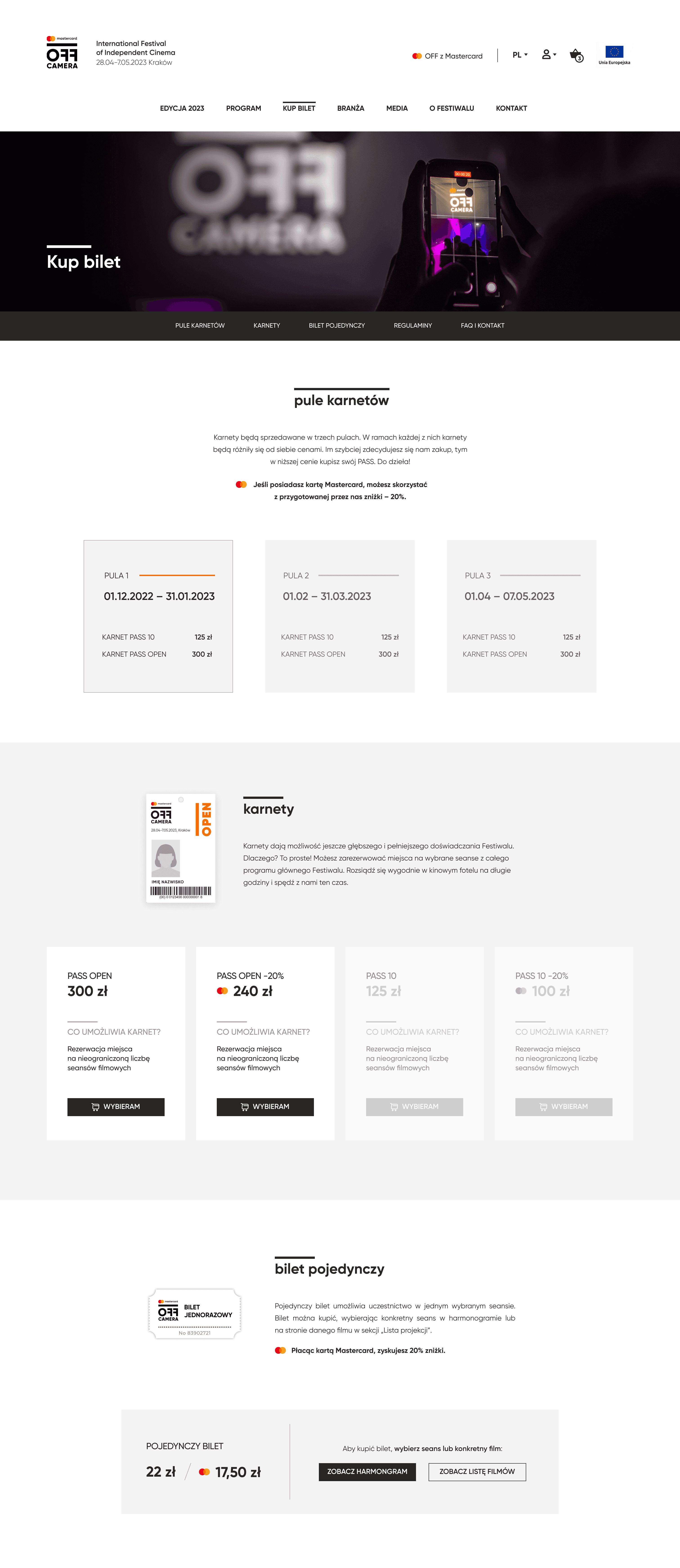
My task was to design the UI of the website and its information architecture in a way that would be user-friendly and easily implementable through Divi for WordPress.

before
after
02 process
03 research
04 ux design
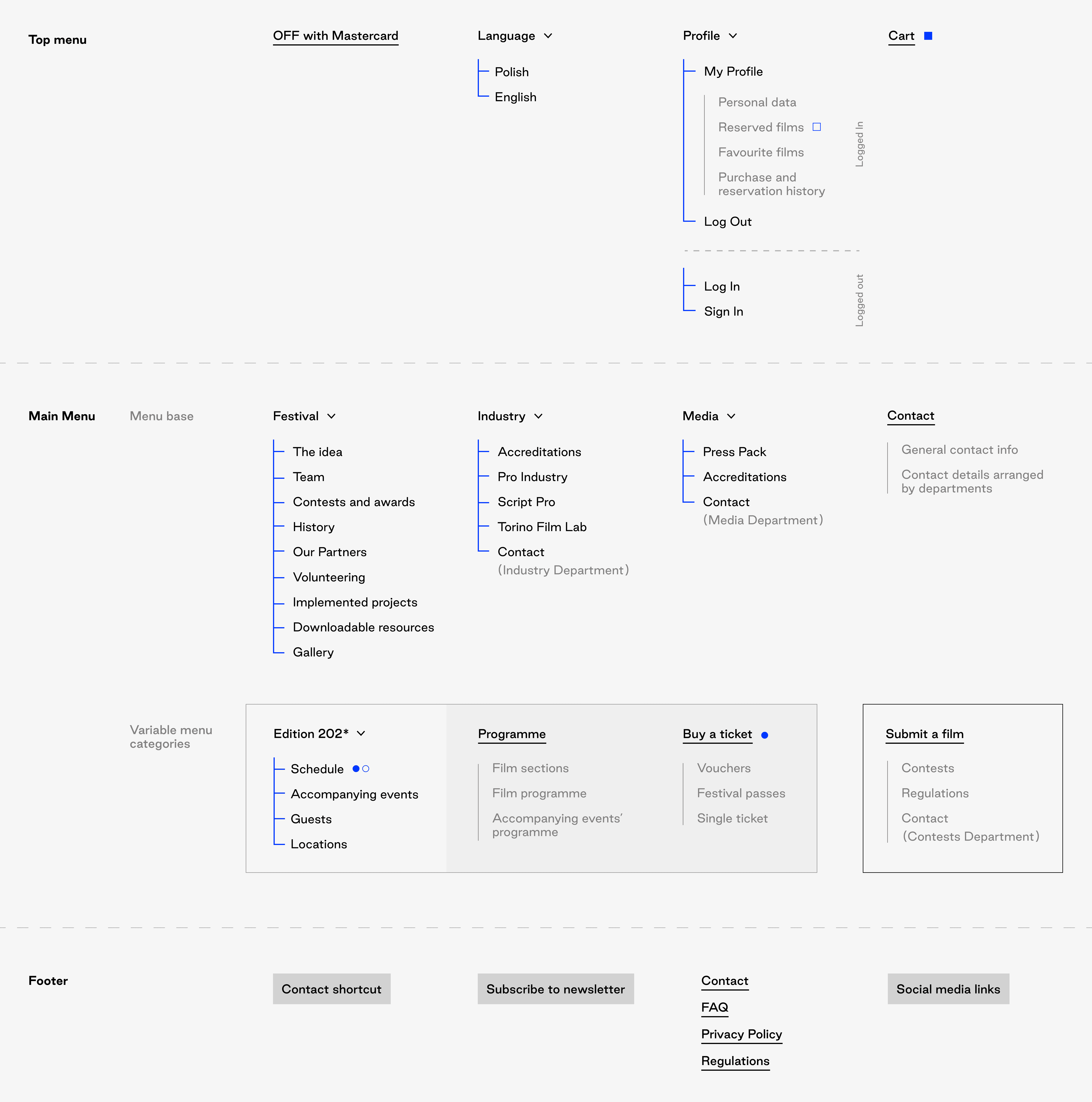
With a complete set of research information in hand, the process of organizing the website's content began. The starting point was the "festival life cycle" divided into three phases:
Pre-festival period (December – April):
A time of increased contact with the film industry, selling passes, and recruiting volunteers.During festival period (April – May):
A period of maximizing all festival activities and the website's most frequent views.Post-festival period (May – December):
A period of hiatus and preliminary preparations, as well as receiving film submissions.
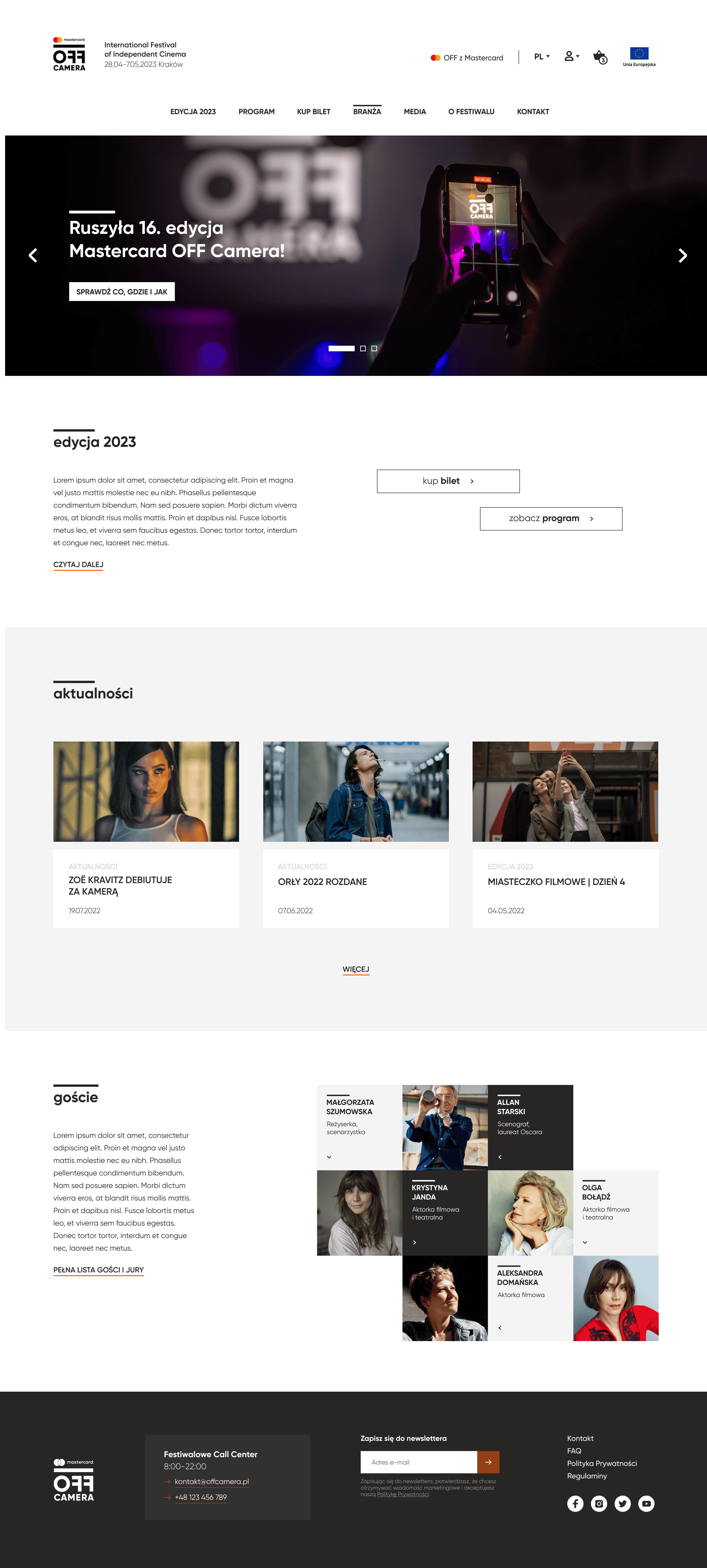
As a result, the information architecture and website structure were designed in three variations dependent on these periods.

05 ui design
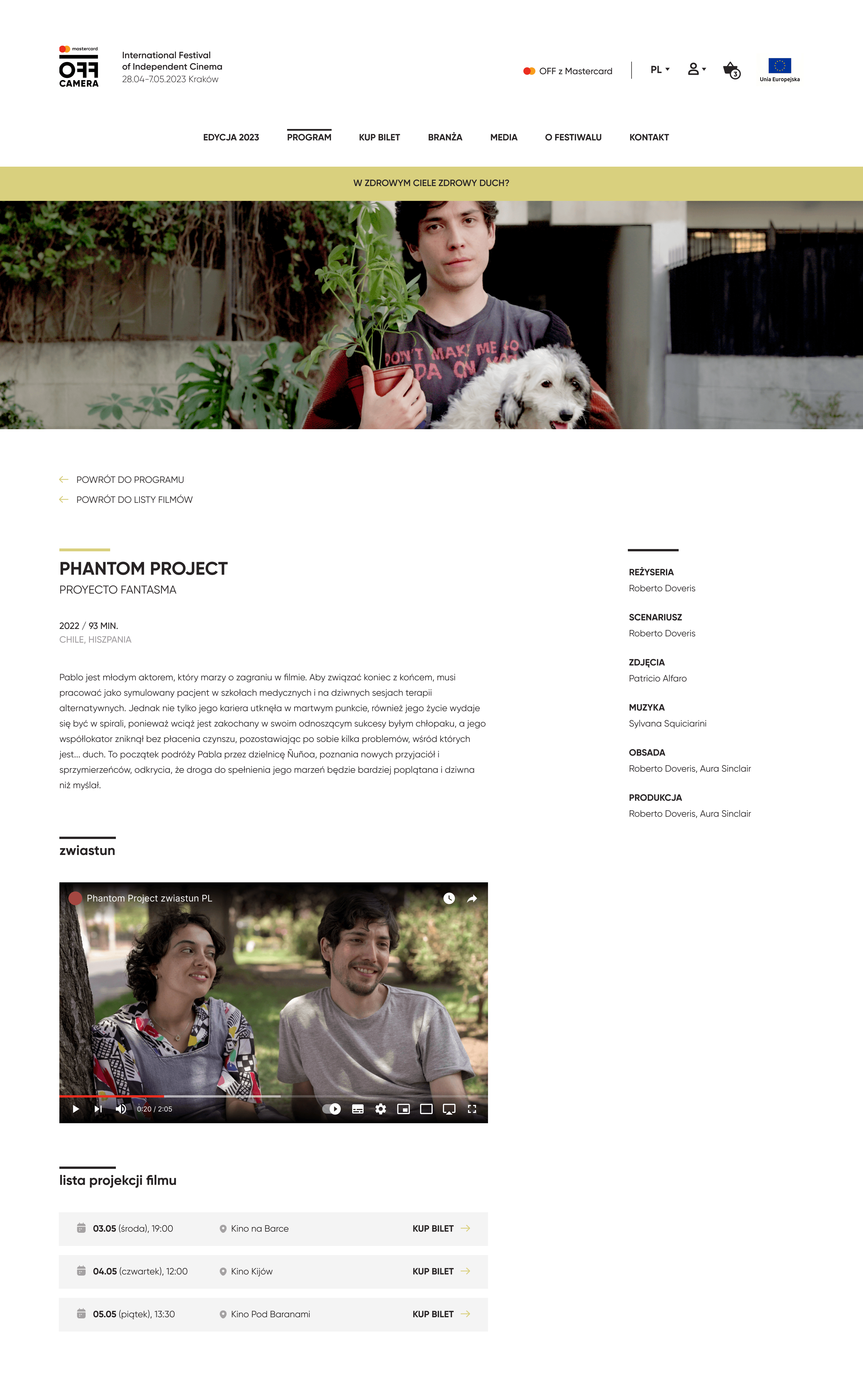
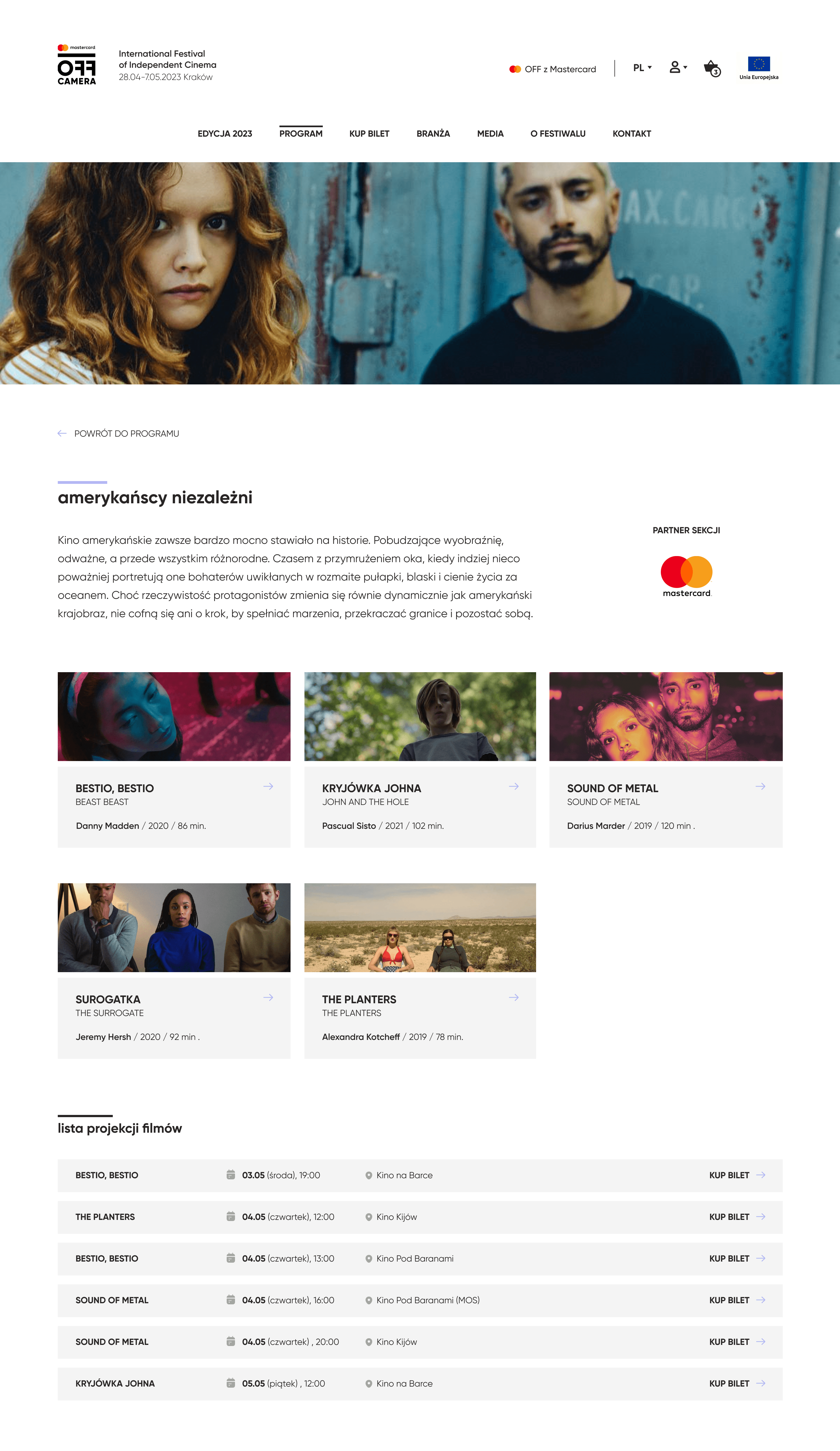
The OFF Camera team wanted the website to be refreshed, yet minimalist, "with more breathing room" and visually timeless. Considering the diverse audience, I focused on ensuring accessibility - thus, we decided on larger text sizes and fewer innovative visual solutions.
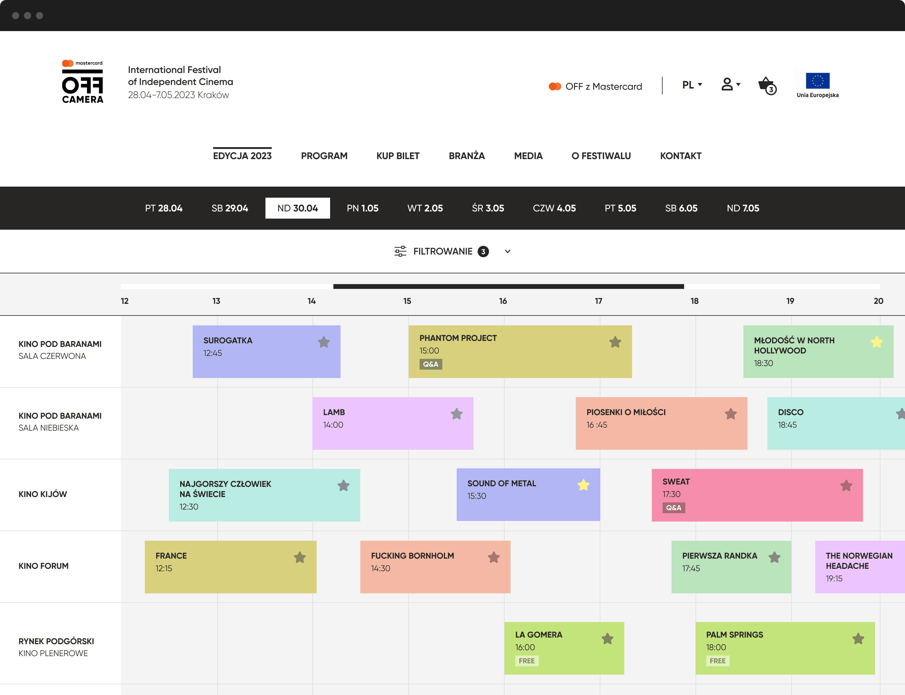
The schedule was a really big issue - the mobile version was simply a scaled-down version of the desktop one. A similar problem occurs with most of our competitors, but according to Google Analytics data, many visits to the site during the festival came from mobile devices. That's why we focused on designing a comfortable way of browsing the schedule on smaller devices.
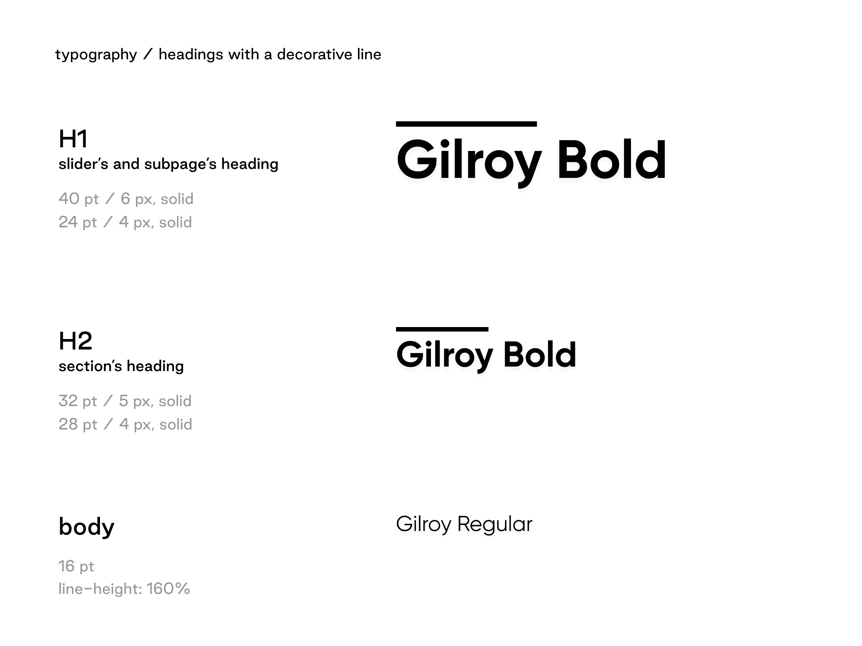
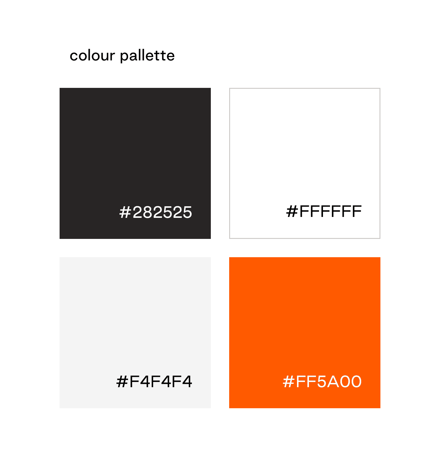
Typography is based on the brand font, Gilroy, and the headers are decorated with the characteristic element of the logo - a line above the text. The color palette is limited to black, white, gray, and orange color appearing in the logo of the titular partner, Mastercard. Thanks to this, pages with a schedule or program are not overwhelmed with colors, and the festival crew has the option to change section colors every year.