Multisport
XII 2022
app design
personal project
Role:
UX research
UX design
UI design

01 problem context
MultiSport is one of the most popular Polish benefit programs, allowing you to use many different sports facilities with just one personalized card. Although the card has a physical form, in order to enter the facility, besides scanning the card, you also need to show an ID, which in an increasingly digitalized world can be perceived as a minor inconvenience.
However, there is a solution to this - the MultiSport app with a virtual card, where you can confirm your identity. Thanks to this, the whole process is reduced to one step, eliminating the need to bring your wallet to your workout.
Unfortunately, this app is not very popular among users. Negative reviews on the App Store (average rating is 1.8) and Google Play (2.2) not only show the scale of unpleasant experiences of people who used it, but also deter new users.
Therefore, with full conviction, I decided to introduce a small redesign of the product and see if improving UX/UI issues can improve the opinion about the app.
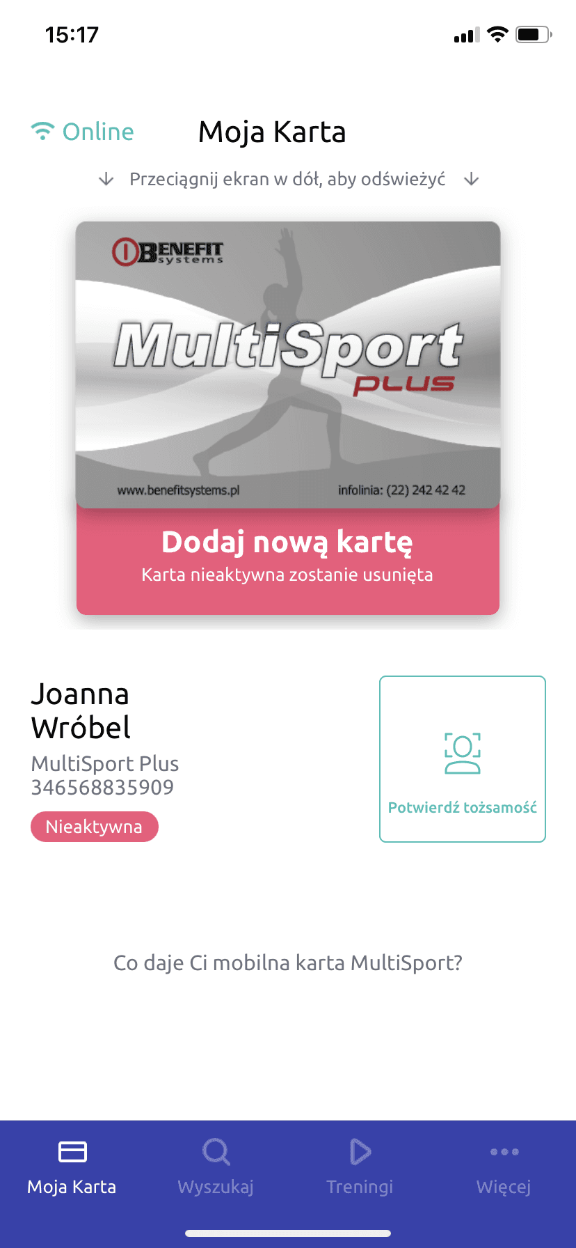
home before / current app
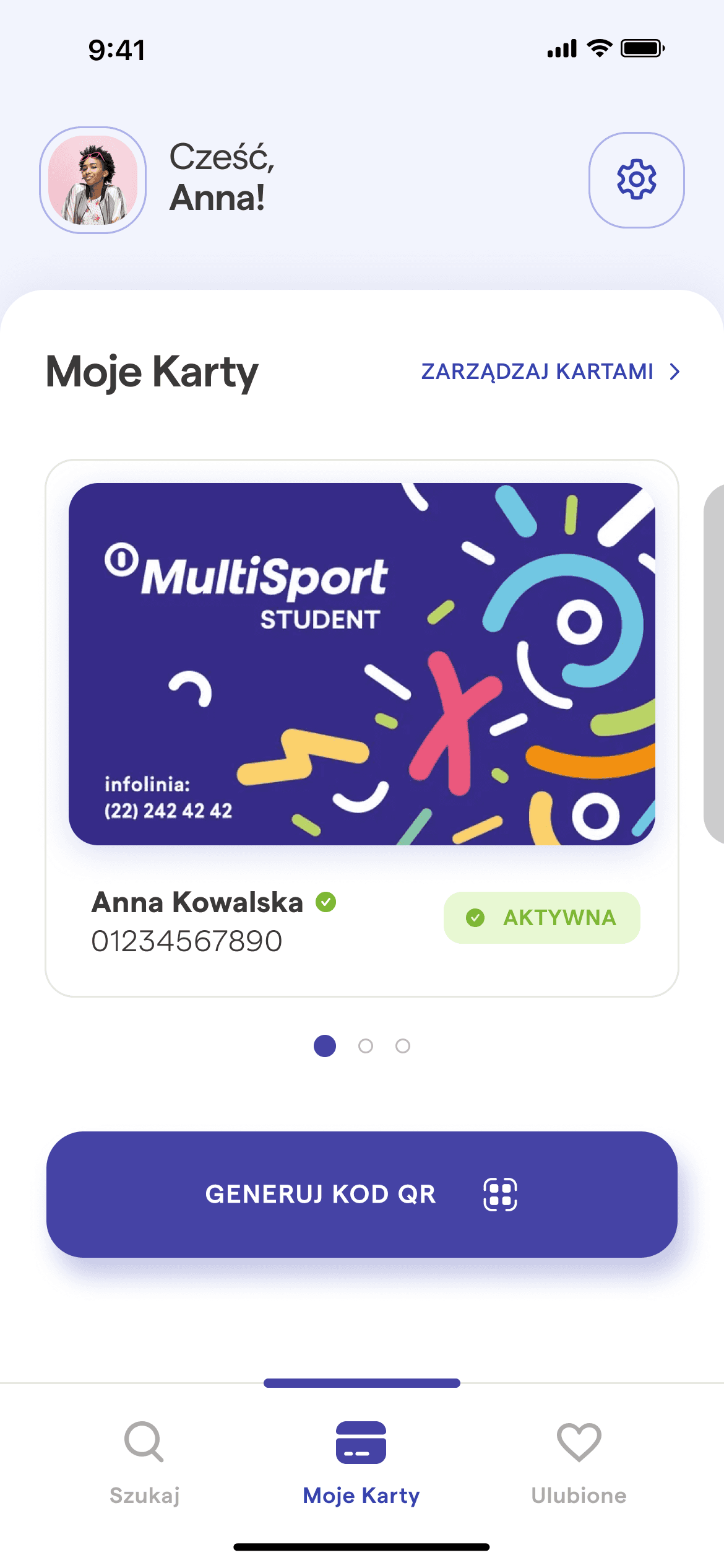
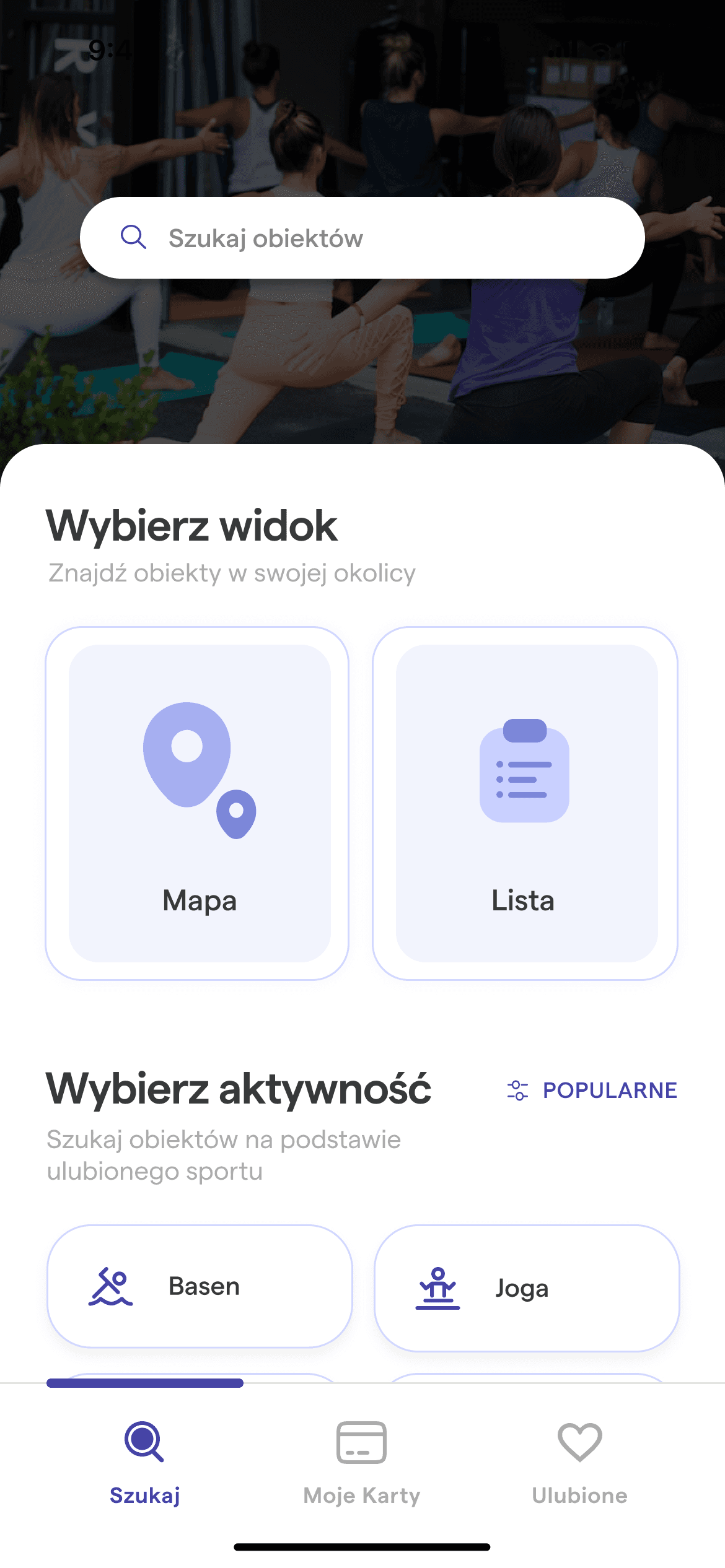
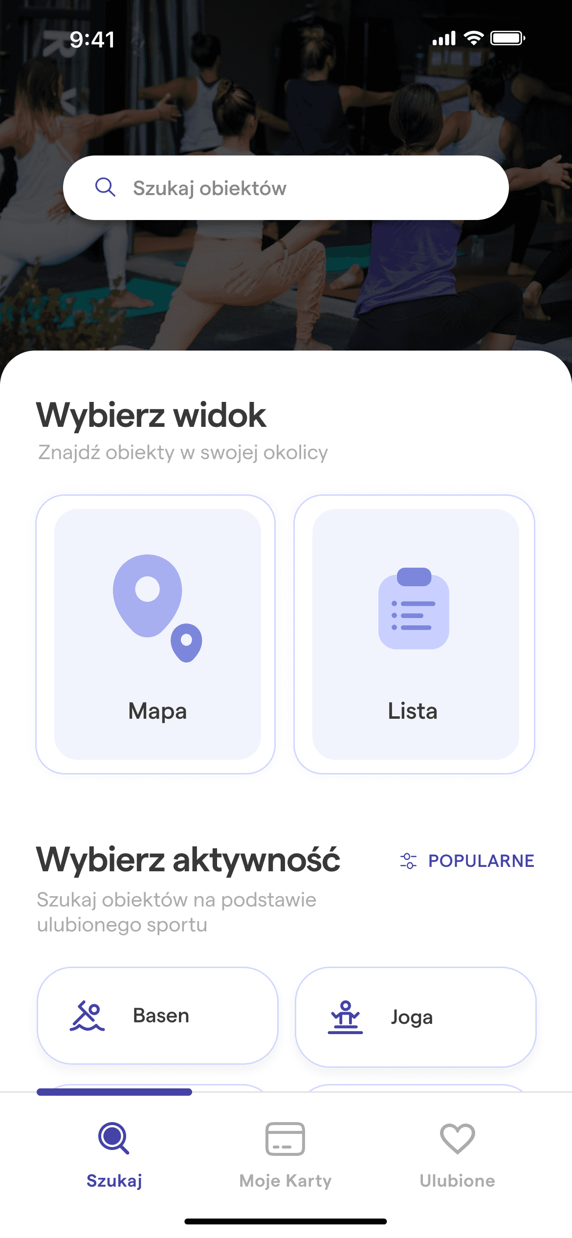
home after
02 process
03 research
04 conclusions
Based on the research data, I drew three main conclusions that became the guiding principles for the subsequent stages of the redesign process:
The most important functions for users are:
scanning the QR code of the card,
searching for objects,
a list of favorite objects.
The content of the application is organized in an unfriendly way for the user.
The object search engine in its current form is useless for the user.
05 UX design
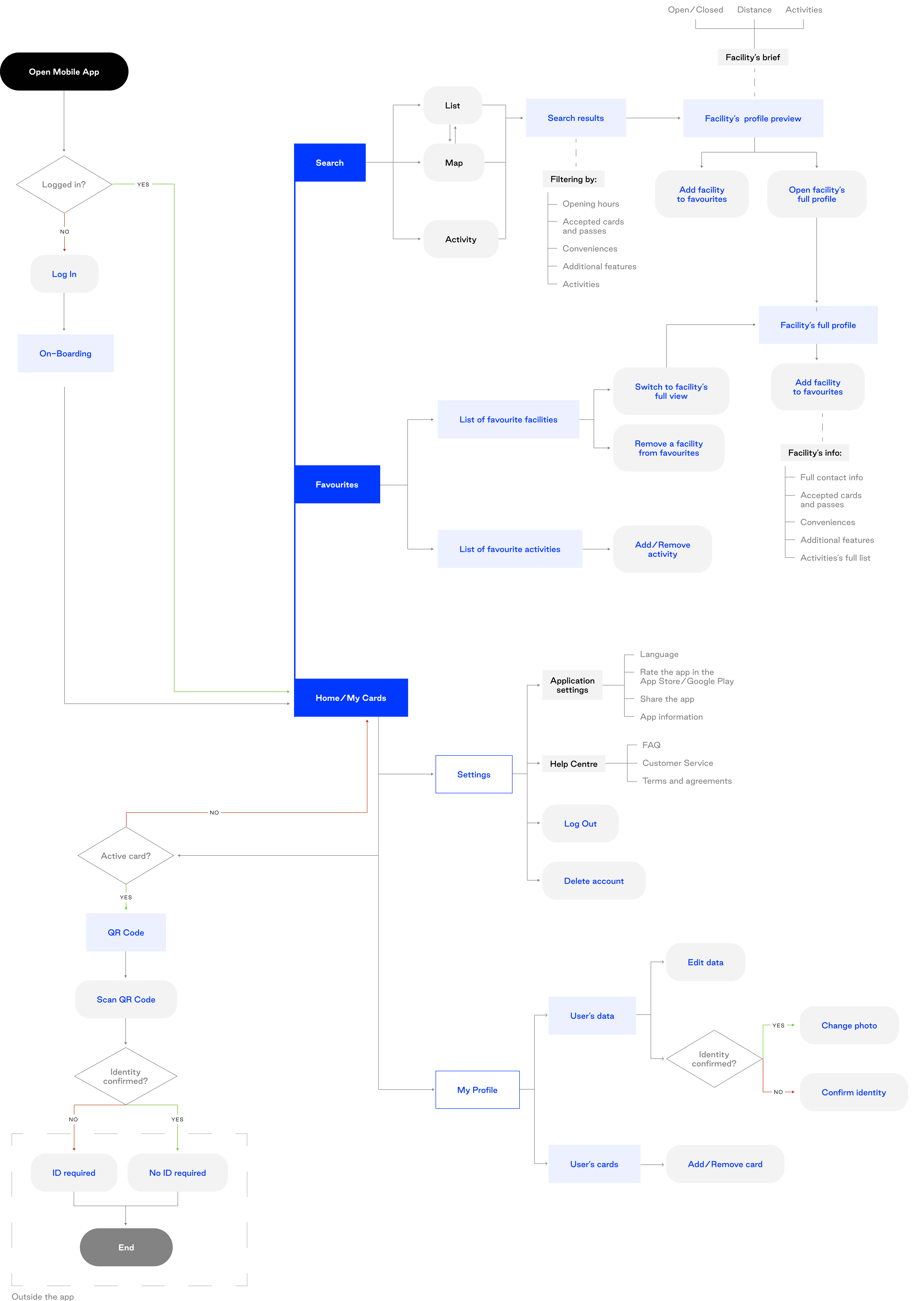
The main goal of this stage was to organize the application's content in a way that would remove the users' main pain points and make it easier for them to find and use the basic application functions.
As this is not a commercial project dependent on the application owner, I also removed features that were deemed unnecessary by usability testing participants.

06 UI design
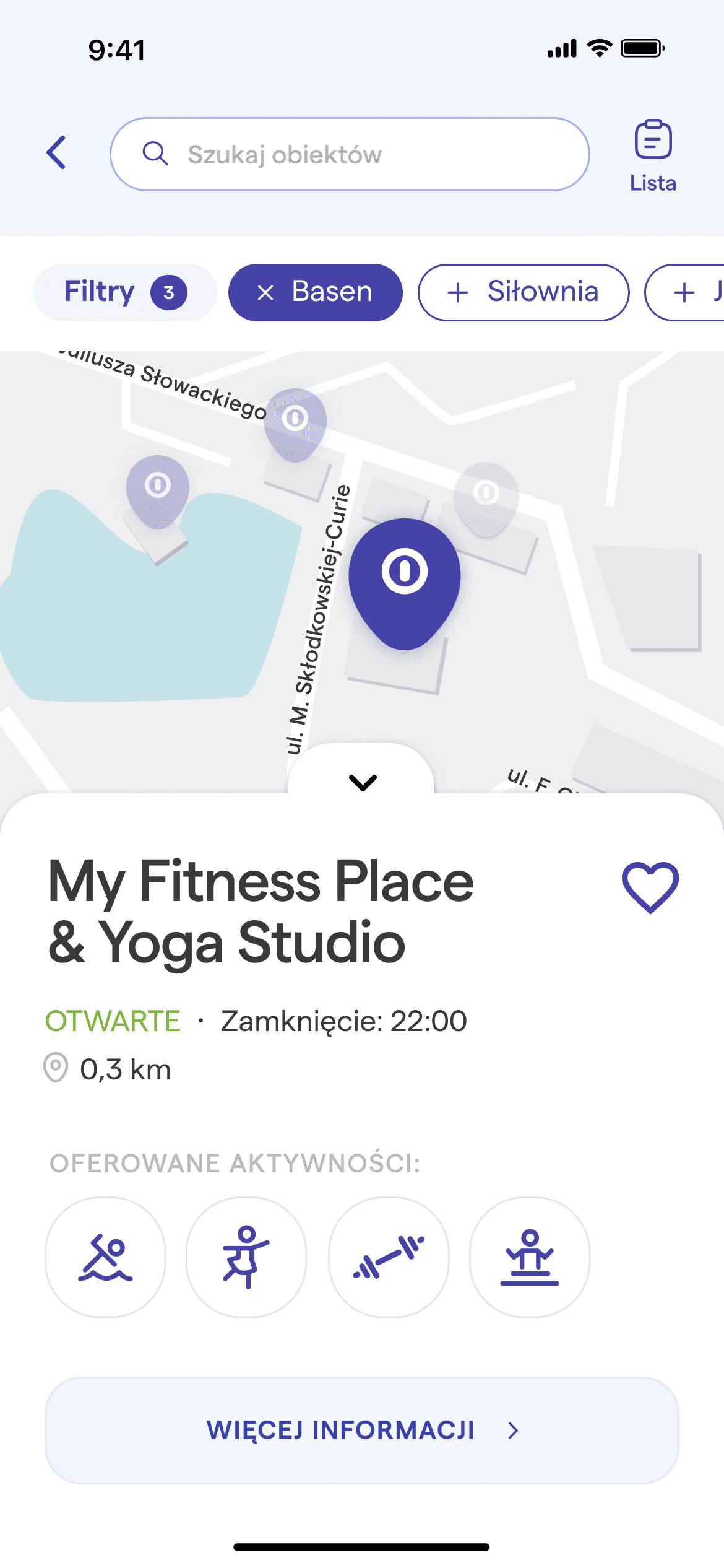
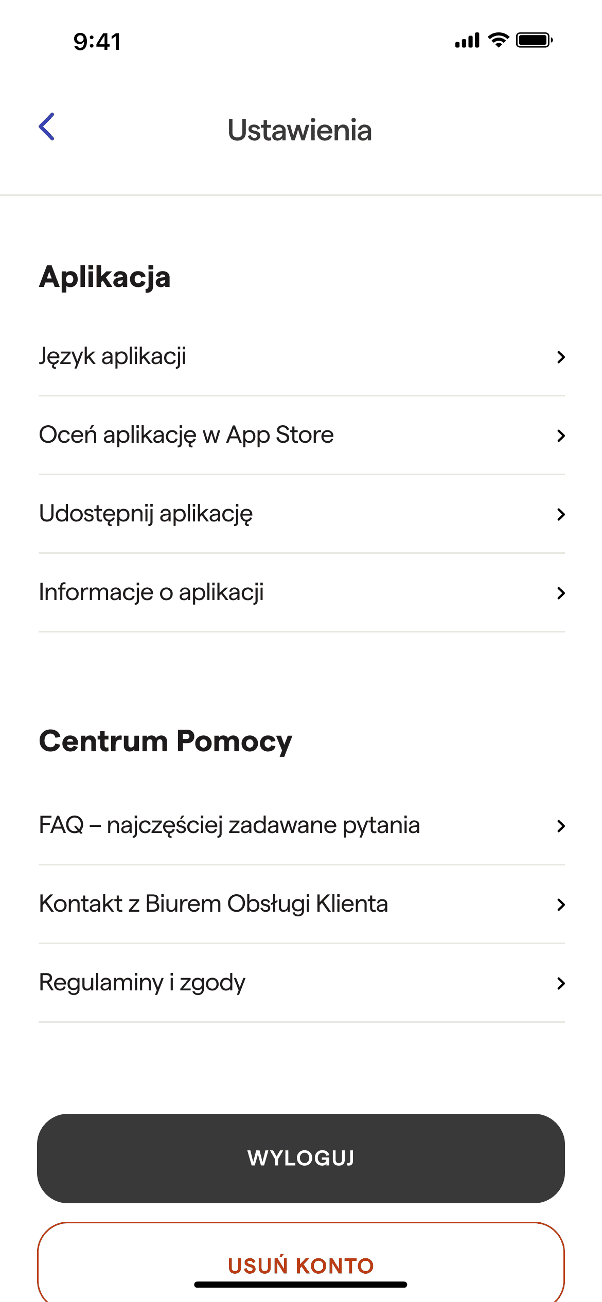
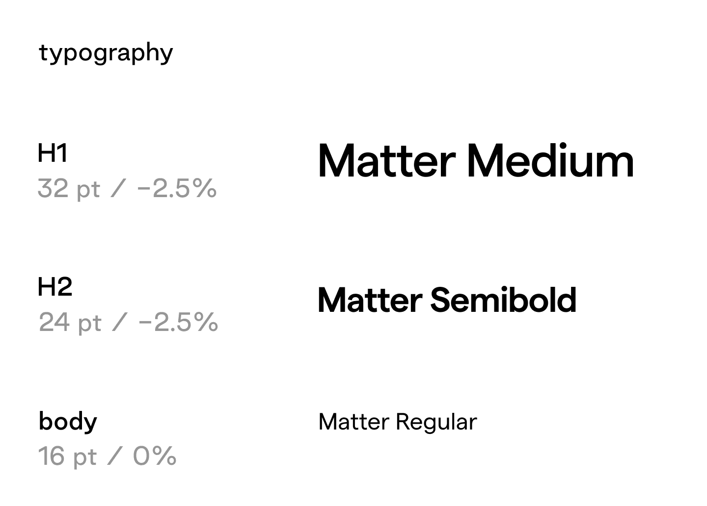
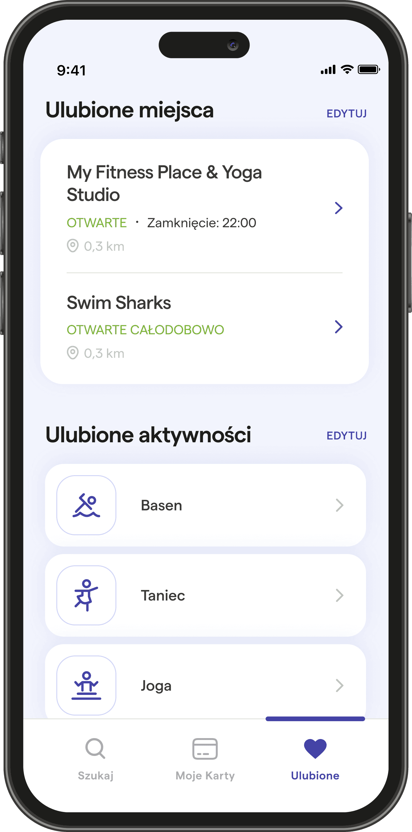
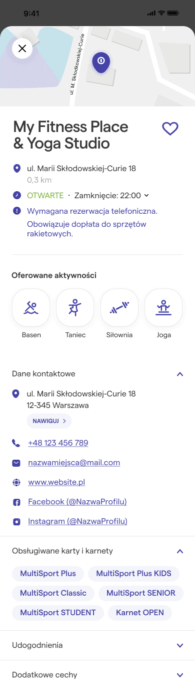
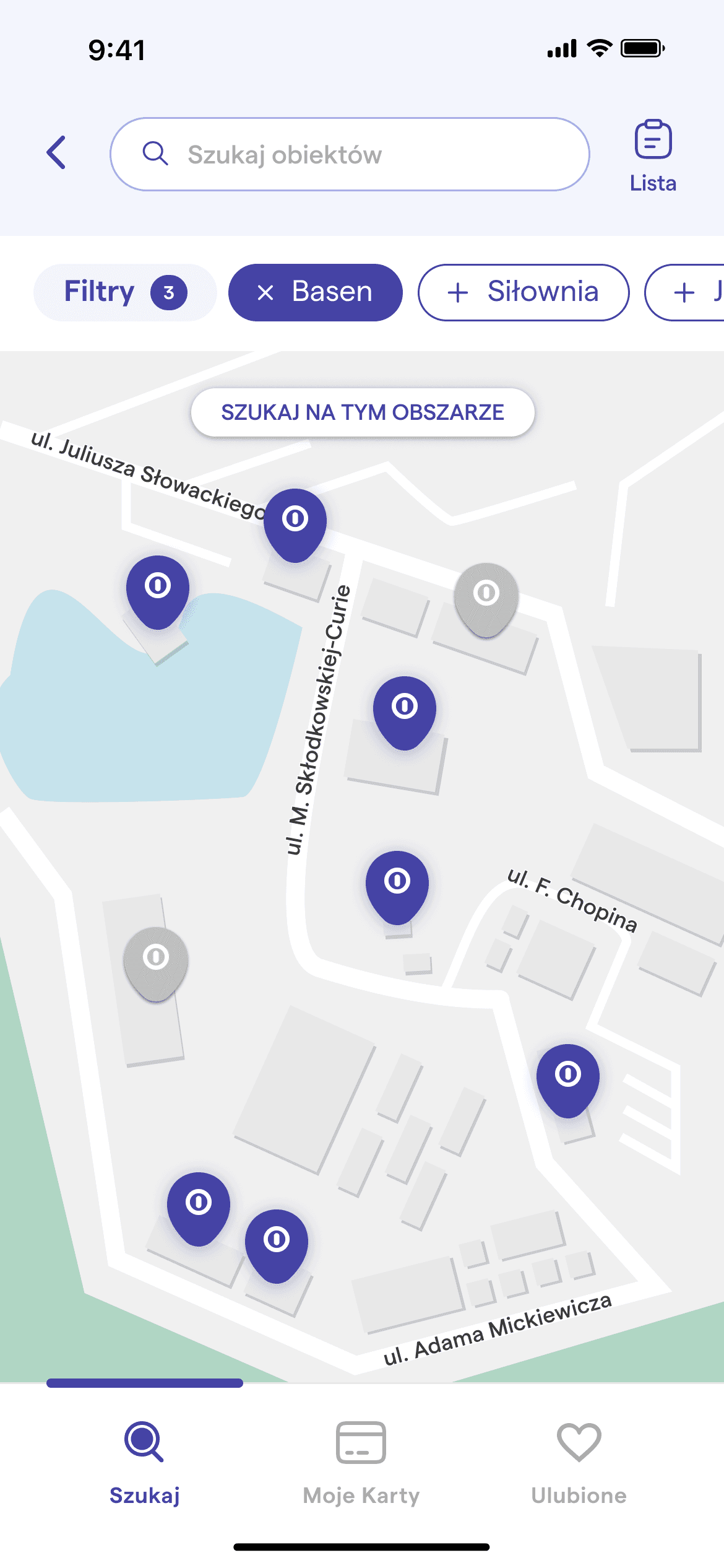
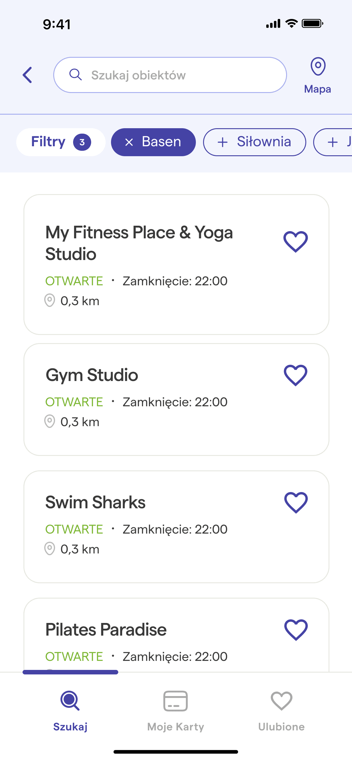
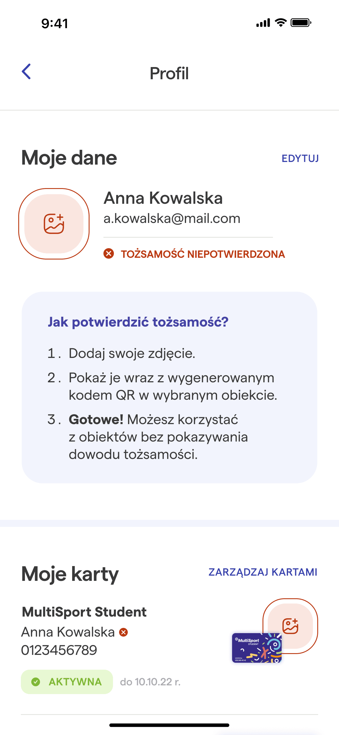
To enhance and modernize brand's image, I've changed the font to Matter typeface that still maintains a similar style to the current font. As for color palette, I opted to move away from the previous celadon shade and introduce a more adaptable monochromatic scheme that's more versatile for any MultiSport card designs. To maintain a contemporary and inviting aesthetic, I also rounded the edges of the rectangular shapes.

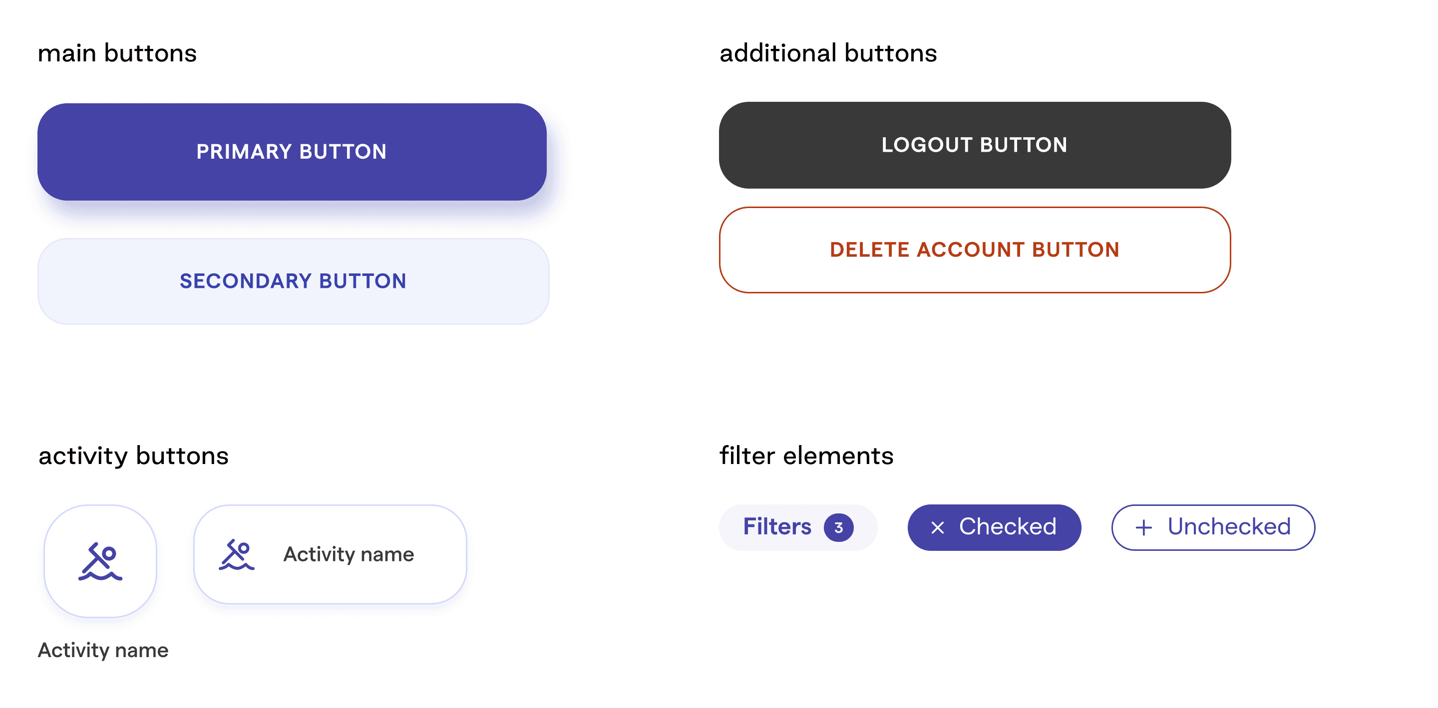

filters before / current app
filters after
settings before / current app
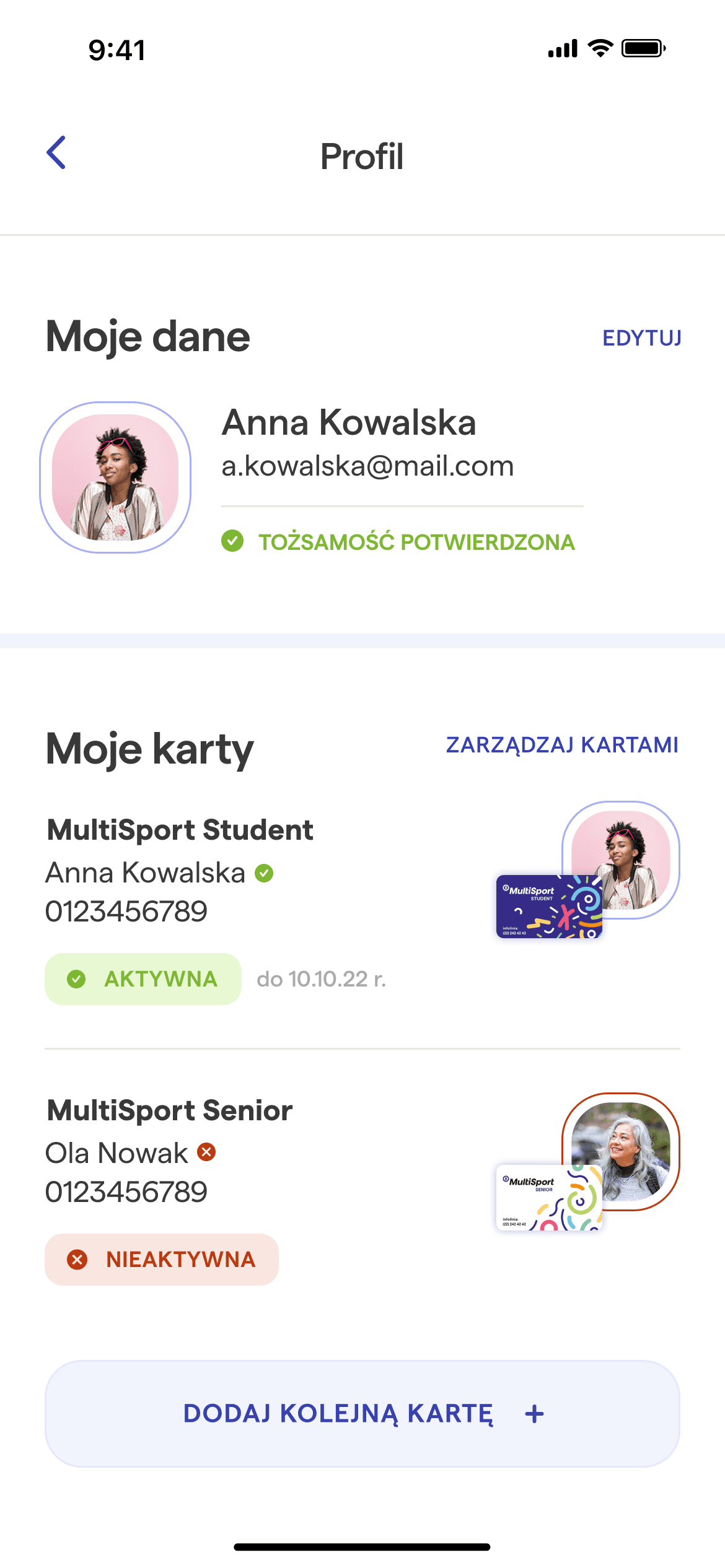
settings after